
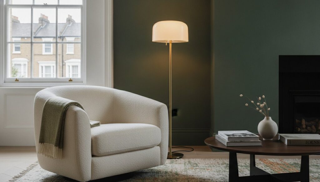
The most instinctive response to a dimly lit space is often the most detrimental: reaching for a tin of brilliant white in hopes of brightening the gloom. Instead of the airy sanctuary you envisioned, you’re left with a room that feels clinical, cold, and stubbornly grey. Choosing paint colours for a north-facing room requires a departure from conventional wisdom, trading the pursuit of artificial brightness for the embrace of depth, pigment, and deliberate warmth.
It’s disheartening to watch a vibrant swatch from the shop floor transform into a muddy shadow once it meets the cool, bluish light of your interior. You likely feel the chill of these spaces even when the heating is high, sensing a lack of soul that no amount of furniture can fix. This 2026 design guide promises to transform your perspective, showing you how to cultivate an enveloping, sophisticated sanctuary using expert colour theory and professional precision. We’ll preview the year’s move toward earthy, in-between shades, discuss the implications of the latest formaldehyde emission standards on your material choices, and explain how specific structural refinements can finally banish the dullness for good.
Key Takeaways
- Learn to identify the “Blue Hour” effect and understand why north-facing light consistently amplifies cool undertones, turning standard whites into clinical greys.
- Master the nuances of choosing paint colours for a north-facing room by selecting yellow or pink-based pigments that radiate warmth even in the absence of direct sun.
- Explore the design-led approach of “leaning in” to darker, saturated hues to create an intimate and sophisticated sanctuary rather than a cold, pale space.
- Discover how specific paint sheens and layered lighting schemes work in tandem with structural finishes to maximise light travel across every surface.
- Understand the importance of expert preparation and perfectly smooth plastering in ensuring your chosen palette reflects light with absolute fidelity.
Understanding the Science of North-Facing Light
The challenge of selecting an interior palette begins with the sun. While south-facing windows bask in a golden, shifting glow, north-facing apertures receive a light that is remarkably consistent yet inherently cool. This light lacks the warm, long-wavelength rays found in direct afternoon sun. Instead, it’s dominated by shorter, blue wavelengths. To master the science of north-facing light, one must understand that this environment acts as a permanent blue filter over your walls. It’s a steady, soft illumination that artists have prized for centuries, but for a homeowner, it can feel uncompromisingly cold.
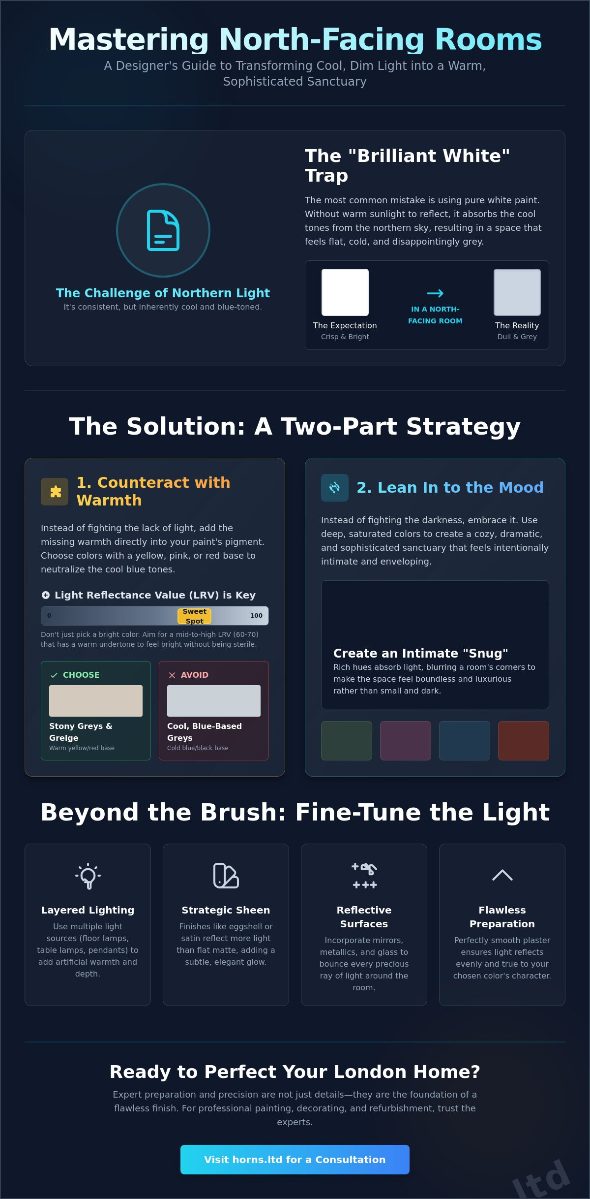
This phenomenon, often referred to as the “Blue Hour” effect, doesn’t just make a room feel dimmer; it actively alters the chemistry of your chosen pigments. When choosing paint colours for a north-facing room, you’re essentially compensating for a lack of natural warmth. This is precisely why standard brilliant white fails so spectacularly in these spaces. White paint requires a high volume of reflected light to appear crisp. In a north-facing room, there are no golden highlights to catch. Without that interplay of light and shadow, white simply defaults to a flat, uninspiring grey. It’s a common mistake that can make a home feel neglected rather than curated.
The Kelvin Scale and Colour Temperature
Natural light is measured on the Kelvin scale. While a sunset might sit at a warm 2000K, north-facing light often reaches the higher, cooler end of the spectrum, frequently exceeding 6500K. This icy temperature “kills” cool-toned pigments. A sophisticated slate grey or a delicate duck-egg blue, which looked ethereal in the showroom, will likely appear cold and clinical once applied. This isn’t just an aesthetic concern. Living in a space that feels perpetually chilly can have a measurable impact on your well-being, often leading to a subtle sense of restlessness or a lack of domestic comfort.
London Architecture and Light Obstruction
In the dense urban fabric of London, the science of light is further complicated by our historic architecture. Victorian and Edwardian homes often feature narrow north-facing “snugs” or kitchens tucked into side returns. These spaces are frequently overshadowed by neighbouring brickwork or tall chimney stacks, which diffuse the already weak north light into a soft, shadowless gloom. Before you begin your renovation, assess whether your room is truly north-facing or if it’s simply obstructed by the city’s verticality. Testing swatches is vital in London’s notoriously overcast climate. A colour that looks perfect on a rare sunny Tuesday might look entirely different during a typical grey Thursday afternoon. Observe your samples at various times to ensure the pigment retains its soul regardless of the weather.
The Warm Neutral Palette: Escaping the “Grey” Trap
Many homeowners assume a neutral palette is a safe harbour for any interior. In reality, north-facing light is a harsh judge of neutral pigments. If you’re choosing paint colours for a north-facing room, you’ve likely noticed how a “perfect” grey from a swatch can suddenly feel like wet concrete once it’s on the wall. This is the grey trap. To escape it, we must look beyond the surface and understand the Light Reflectance Value (LRV). This metric, often overlooked by amateur decorators, is the key to predicting how a colour will behave in the shadows.
LRV is a scale from 0 to 100 that measures how much light a colour reflects versus how much it absorbs. In a dark, north-facing room, you might think a high LRV, closer to 100, is the ultimate goal. However, a high LRV paint with cool undertones will only reflect the bluish light we’re trying to counteract. The secret lies in finding a mid-to-high LRV, typically around 60 to 70, that carries a warm base. This ensures the room feels bright without turning clinical. Professional paint charts distinguish between “stony” and “cold” greys. Stony greys contain red or yellow ochre, giving them a grounded, earthy warmth, whereas cold greys rely on blue or black pigments. In a north-facing snug, a stony grey feels like an embrace; a cold grey feels like a shadow.
Greige has emerged as the definitive bridge for 2026. It offers the sleekness of grey with the soul of beige. It’s the perfect canvas for those who want a modern aesthetic that doesn’t sacrifice comfort. Achieving this balance requires precision, which is why many clients seek professional painting and decorating to ensure the finish is as flawless as the pigment choice.
Choosing the Right Undertones
To neutralise the “Blue Hour” effect, your palette needs a secret weapon: warm undertones. Look for neutrals with a hint of pink, peach, or yellow. These pigments act as a thermal layer for the eyes. Designers often favour complex shades like “Elephant’s Breath” styles for London terraces because they possess a violet-pink base that thrives in cool light. You should avoid green-based neutrals at all costs. In low light, green undertones often appear muddy or sickly, draining the life from the architecture.
The Myth of Brilliant White
Brilliant white is the enemy of the north-facing room. It’s a stark, pigment-free choice that relies entirely on external light to provide character. Without direct sun, it turns a flat, depressing grey. Instead, opt for off-whites that lean toward clotted cream or soft stone. These shades provide the illusion of a white room but with enough internal warmth to stay alive on a cloudy day. For a sophisticated touch, use these warmer whites on the walls and a slightly crisper white on the woodwork to create a subtle, architectural contrast.
Embracing the Dark: Saturated Hues for North-Facing Snugs
There is a common misconception that small, dimly lit rooms must be painted in pale tones to feel larger. In reality, the opposite is often true. When choosing paint colours for a north-facing room that lacks inherent architectural drama, leaning into the darkness can be a transformative design choice. Saturated, deep hues don’t fight the shadows; they use them to create a sense of infinite depth. In a room where natural light is flat and uncompromising, light colours often lose their definition. Darker pigments, however, provide the visual weight necessary to hide the lack of natural shadow play, creating an enveloping sanctuary that feels deliberate rather than neglected.
This “jewel box” effect is particularly potent in intimate spaces such as home offices, libraries, or media rooms. By selecting colours with significant chromatic depth, you transform a potentially “cold” space into a sophisticated retreat. The secret lies in the undertone. A navy blue with a subtle red base will feel significantly warmer than one leaning toward slate. Similarly, a rich forest green or a deep terracotta provides a grounded, organic feel that thrives in the soft, consistent light of a northern exposure. These colours don’t just sit on the surface; they absorb the cool light and give the room a soul.
Rich Browns and Earthy Tones
The 2026 interior landscape has seen a profound resurgence of chocolate browns and burnt terracottas. These aren’t the flat, muddy tones of decades past, but complex, pigment-rich shades that radiate a quiet luxury. In a north-facing room, these earthy palettes are exceptionally effective because they naturally counteract the “Blue Hour” effect. While cool light can make greys feel clinical, it makes deep browns feel velvety and expensive. Under the warm glow of evening lamplight, these walls come alive, creating a cocoon-like atmosphere. To maintain a sense of balance and prevent the space from feeling heavy, pair these saturated wall colours with light-coloured flooring, such as bleached oak or pale limestone, and crisp architectural detailing.
The Power of “Brave” Blues and Greens
If you prefer a cooler palette, you must be brave with your selection. Avoid the timid pastels of mint or sage, which often look sickly in a north-facing light. Instead, opt for deep olive greens or teals. Olive green, with its heavy yellow and brown base, feels organic and inherently warm. When integrated into full home refurbishments, these “brave” colours can be used to define the mood of a transition space or a dedicated evening room. Blue can also work beautifully, provided it contains a hint of teal or violet to prevent a “hospital” feel. These saturated tones ensure your north-facing room possesses a distinct character that pale, cool-toned alternatives simply cannot provide.
Beyond the Brush: Structural and Reflective Light Maximisation
While the artistic choice of pigment provides the emotional foundation of a space, the technical execution of light management determines its final atmosphere. Choosing paint colours for a north-facing room is a masterclass in compromise unless you address the physical surfaces those colours inhabit. Light in these rooms doesn’t just need to be invited; it must be managed with engineering precision. The way light travels across a room is dictated by texture, sheen, and the architectural skeleton of the building itself. If the canvas is flawed, even the most sophisticated palette will fail to achieve its potential.
Artificial lighting plays a critical role in supplementing the missing golden wavelengths. To counteract the persistent blue tint, you should avoid cool-white bulbs, which only amplify the clinical feel of a northern exposure. Instead, layer your lighting using warm-toned LEDs, typically around 2700K. This creates a synthetic “golden hour” that breathes life into your chosen pigments. Mirrors should be placed perpendicular to the window rather than directly opposite; this allows them to catch the indirect brightness and bounce it into the deeper, shadowed corners of the room without creating a harsh glare. If these internal adjustments aren’t enough to banish the gloom, a bespoke house extension can offer a more permanent solution, introducing roof lanterns or floor-to-ceiling glazing to radically alter the room’s light profile.
Paint Finishes and Reflective Surfaces
The sheen of your paint is as vital as the hue. While a flat matt finish is often preferred for its contemporary, velvety depth, it can absorb too much of the limited light available in a north-facing snug. Consider an eggshell or soft-satin finish for woodwork and even certain wall areas to catch peripheral light; for a factory-standard finish on internal fixtures, SKR Specialists provides professional respraying that ensures a perfectly smooth, light-reflective surface. A bold trend for 2026 involves using a high-gloss finish on the ceiling. This creates a luminous “sky” effect that reflects every available lumen back down into the living space. You can further enhance this warmth by incorporating metallic accents; brass and copper are particularly effective, as their natural orange and red tones provide a constant, warm reflection that fights the external chill.
Renovation Solutions for Dark Spaces
Sometimes, the limitations of the original structure require a more robust intervention. During a loft conversion, the installation of high-performance skylights or Sun Tunnels can flood a north-facing area with zenithal light, which is far brighter than light from a side window. Internal glazing is another sophisticated tool; using Crittall-style doors allows you to “borrow” light from south-facing hallways or kitchens without sacrificing acoustic privacy. For those seeking a total transformation, increasing the window apertures during a structural refurbishment can fundamentally change how a room breathes. If you’re considering such significant changes, our team provides expert full home refurbishments that harmonise architectural precision with aesthetic excellence.
Professional Decorating and Refurbishment in London
The most sophisticated palette remains a mere abstraction until it’s realised upon a perfectly prepared surface. While the theory behind choosing paint colours for a north-facing room focuses on pigments and light wavelengths, the physical reality of your walls dictates the final resonance of the space. In the cool, unforgiving light of a northern exposure, every minute imperfection becomes a focal point. With over 20 years of experience navigating the architectural nuances of London’s residential landscape, Horns Construction brings a level of technical fidelity that transforms simple decorating into a form of structural art. We understand that a premium finish isn’t just about the final coat; it’s about the meticulous engineering of the substrate beneath.
Our “Design and Build” philosophy is particularly valuable for light-starved properties. Rather than treating paint as an afterthought, we coordinate your chosen hues with bespoke cabinetry, flooring, and architectural joinery from the very beginning. This holistic approach ensures that the warm undertones you’ve selected are complemented by the natural grain of your timber or the reflective quality of your stone surfaces. By integrating colour consultation into the earliest stages of a refurbishment, we eliminate the guesswork and ensure that the final result feels cohesive, intentional, and timeless.
The Importance of Surface Preparation
In a north-facing room, the lack of direct sunlight means that shadows are soft and pervasive. If your walls aren’t perfectly plumb and smooth, even the most expensive warm-based neutral will appear patchy. Tiny ridges or depressions in the plaster catch the cool light, creating micro-shadows that disrupt the colour’s intended warmth. Achieving a “gallery finish” requires a commitment to preparation that goes far beyond the industry standard. We utilise high-performance primers and multiple stages of fine-sanding to ensure the surface is as reflective as possible. This meticulous process ensures that the pigment stays true to its swatch, radiating the sophisticated glow you envisioned regardless of the London weather.
Starting Your London Renovation Journey
At Horns Construction, we specialise in weaving aesthetic beauty into the functional skeleton of a home. We seamlessly integrate expert colour strategy into our kitchen renovation projects and bespoke bathroom fitting services, ensuring that even the most challenging rooms feel expansive and inviting. Our process is defined by a quiet, methodical precision, moving from the initial structural planning to the final, masterful application of paint. If you’re ready to transform your property into a sanctuary of light and warmth, we invite you to book a consultation for your London home refurbishment and experience the difference that 20 years of uncompromising craftsmanship can make.
Mastering the Art of Illumination
Transforming a cool, north-facing space into a sanctuary of warmth is a delicate balance of science and artistic intuition. We’ve explored how the “Blue Hour” effect dictates the necessity of warm-based pigments and how leaning into saturated hues can create a “jewel box” effect that transcends the limitations of natural light. Success in choosing paint colours for a north-facing room ultimately relies on the harmony between colour theory and the physical integrity of the walls themselves. When structural refinements like internal glazing are paired with a perfectly prepared surface, the result is an atmosphere of quiet luxury that defies the overcast London sky.
Bringing this vision to life requires a partner who understands the complexities of high-end residential refurbishments. With over 20 years of West London renovation experience, our team provides full project management from the initial architectural design to the final, masterful stroke of decoration. We specialise in creating homes that are not just seen, but felt. You can transform your London home with Horns Construction and ensure your interior reflects the uncompromising quality you deserve. Your home has the potential to be a radiant retreat; it simply awaits the right touch of professional precision.
Frequently Asked Questions
What is the best white paint for a north-facing room?
The most effective white for a north-facing space is an off-white that contains a warm, creamy, or pink-based undertone. Pure, brilliant white lacks the necessary pigment to counteract cool, bluish light and will inevitably appear a flat, clinical grey. Selecting a white with a hint of yellow or red ochre ensures the room remains bright while feeling intentionally curated and warm.
Can I use grey in a north-facing room without it feeling cold?
You can certainly use grey, provided you select “stony” varieties that possess yellow or red bases. It is vital to avoid greys with blue or green undertones, as the northern exposure will amplify these cool wavelengths and make the space feel damp. A sophisticated “greige” that balances the sleekness of grey with the soul of beige is often the most successful choice for a contemporary London home.
Do north-facing rooms always need warm colours?
While warm colours are the most reliable for ensuring domestic comfort, they are not your only option. You can achieve a stunning result by “leaning in” to deep, saturated cool tones like teal or navy to create an intimate, enveloping sanctuary. The only colours to strictly avoid are pale, icy blues or mint greens, as these will look washed out and sickly in a room that lacks golden sunlight.
How does Light Reflectance Value (LRV) affect my colour choice?
LRV measures the percentage of light a colour reflects versus how much it absorbs. In north-facing spaces, a mid-to-high LRV around 60 to 70 is beneficial, but only if the paint carries a warm base. A high LRV cool colour will simply reflect the existing bluish light, making the room feel colder. Understanding this metric is a core part of choosing paint colours for a north-facing room that feel both bright and inviting.
Should I use matt or silk paint in a dark room?
A premium flat matt finish provides a sophisticated, velvety depth that is ideal for hiding wall imperfections and absorbing light in a soft, pleasing way. However, if the room is exceptionally dark, a soft-sheen finish like eggshell on the woodwork or even a high-gloss ceiling can help bounce limited light across the surfaces. This technical choice should be balanced against the desired aesthetic of the refurbishment.
Will a skylight make a north-facing room feel warmer?
A skylight will significantly increase the volume of natural light, making the space feel considerably brighter, though not necessarily “warmer” in tone. Zenithal light from above is far more intense than indirect light from a side window. While the light remains cool, the increased luminosity prevents colours from “dying” in the shadows and allows you to experiment with a broader range of pigments.
How do I test paint colours accurately in London light?
Testing requires observing large swatches on multiple walls throughout the day, especially during London’s frequent overcast afternoons. Paint at least a one-metre square area to see how the pigment reacts to the “Blue Hour” and your evening artificial lighting. This methodical approach ensures the colour maintains its integrity and warmth even when the external light is at its most grey and uncompromising.
Are dark colours a mistake for small, north-facing bedrooms?
Dark colours are often the most sophisticated solution for small, light-starved bedrooms. By embracing deep tones like forest green, chocolate brown, or terracotta, you create a deliberate “jewel box” effect that feels intimate and expensive. These saturated hues provide a sense of visual depth and soul that pale, cool-toned colours simply cannot achieve in a space that lacks natural shadow play.